
Visual Identity
Logo
Overview
The Truckstop logo combines three simple elements that quickly communicate the work we do every day. The red waypoint is a common navigational element that represents how our platform helps keep the country moving. Inside, the truck elements represent those we serve in the trucking and freight industry who make that possible. The bold, geometric type reflects our strong industry presence and our innovative software technology.
Primary Logo
The red-black or red-white versions of the Truckstop logo are the preferred logos for use. Choose the option that provides the best contrast with its environment.
Logo Variations
When color is unavailable, use the black or white variation that provides the most contrast with its background.
-

Black monochrome logo variation
Use on light backgrounds and over light imagery. -

White monochrome logo variation
Use on dark backgrounds and over dark imagery. -

Single color logo
Use for print situations where only ONE color is available.
Clear Space
A minimum area of space must always surround the mark/logotype lockups. This open area ensures visibility and impact.
This clear space is based on the x-height of the height of the arms of the ‘k’.
Do’s and Don’ts
-

Do
Do ensure logo placement on photos doesn’t interfere with logo integrity. -

Do not
Do not place logo over busy backgrounds or photos. -

Do not
Do not remove waypoint from main logomark. -
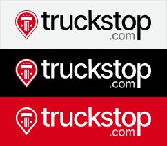
Do
Do use the correct logo colorway to ensure readability. -
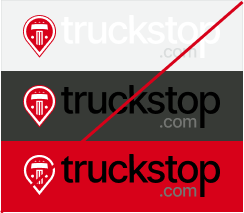
Do not
Do not use a logo in combination with background that creates
low readability. -
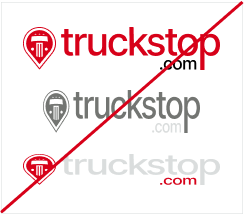
Do not
Do not recolor, stretch, or rotate logo or add shadows or other effects. -
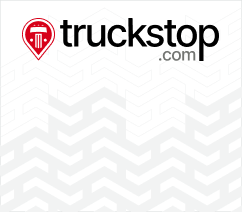
Do
Do ensure logo placement on patterns doesn’t interfere with logo integrity. -
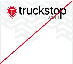
Do not
Do not obscure logo or copy with distracting patterns. -
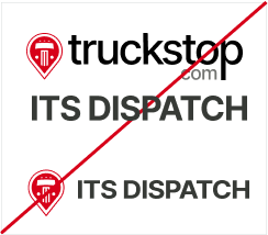
Do not
Do not create unauthorized lockups, including for products or departments. -
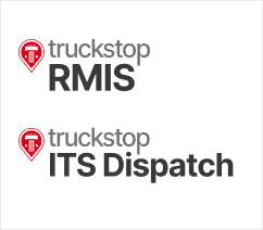
Do
Do use approved product lockup logo files. -
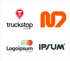
Do
Do use alternate logo to stand out against competitor logos in confined spaces. -
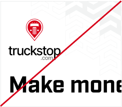
Do not
Do not use alternate logo for general use.
Waypoint
The waypoint may be used as a stand-alone element. Avoid using it too close to the primary logo in the same environment. For example, a document may have a waypoint at the top near the title and a full logo in the footer — but not both in close proximity.
-

Red
Preferred in most all uses. -

Monochrome
For when no color is available. -

Single Color
For embroidery, screenprinting, etc.